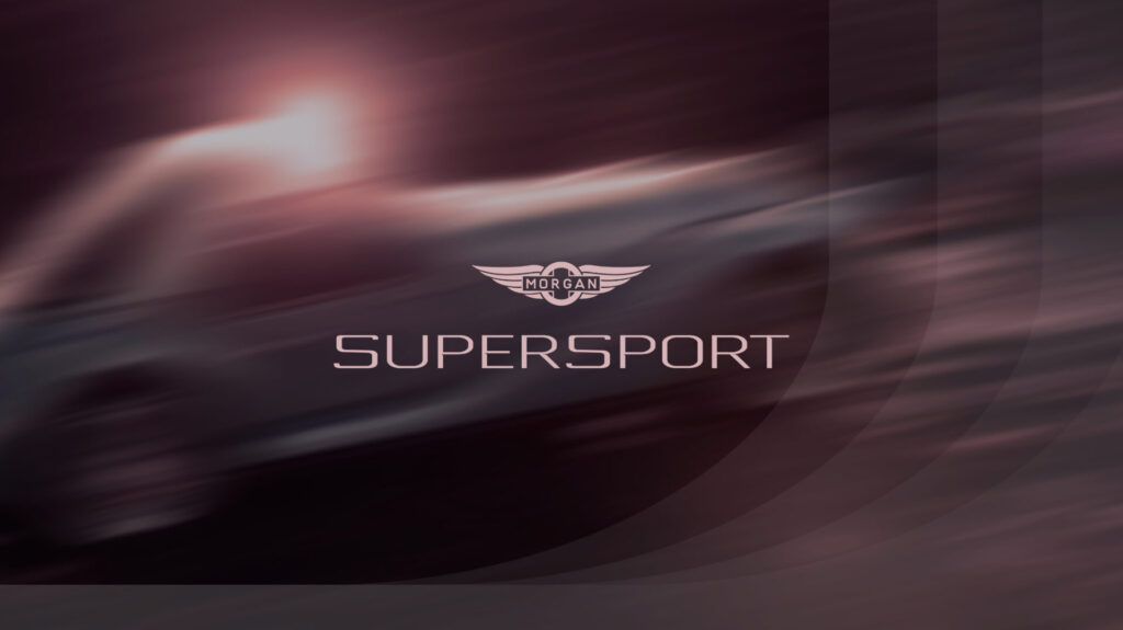
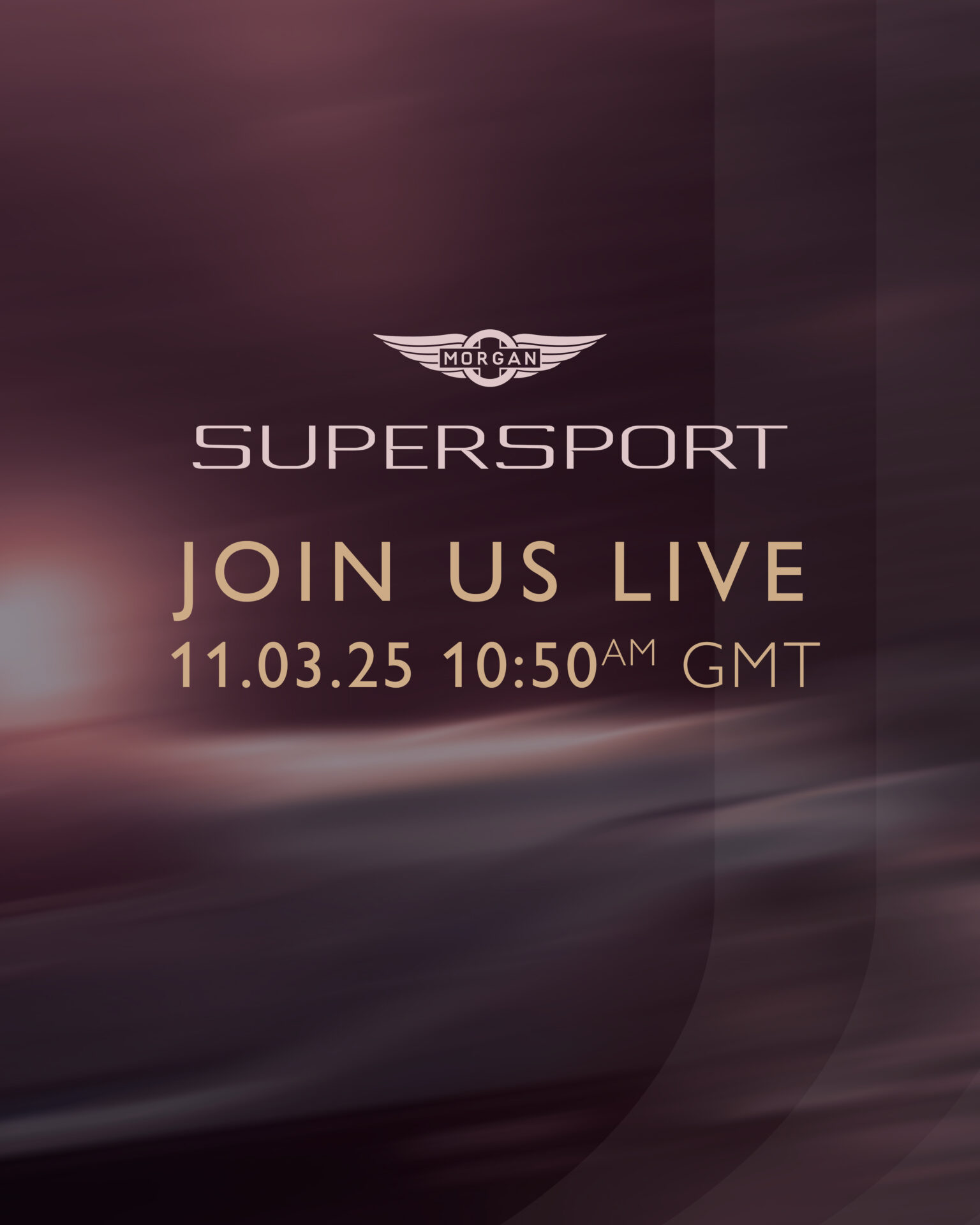
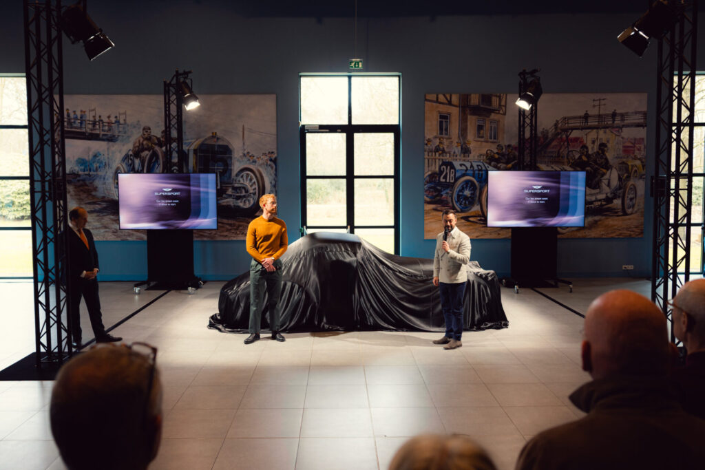
I was tasked with creating assets for the launch of Morgan’s all-new flagship car, Supersport. This involved developing a visual language, colour palette and photo treatment that could be applied to a variety of medias.
The launch of the new Morgan Supersport was all about unveiling the new Morgan flagship and celebrating the great achievement and the hard work that went into the car. The look and feel for the launch event was designed to show movement, speed, and the thrill of driving.
I wanted to capture the feeling of excitement that would be felt both when attending the launch event and when driving the car itself. This treatment to the imagery is to remind you of the fleeting moments that make up a perfect drive: golden hour light going past, the rush of acceleration, and the exhilaration that comes with driving a car as fun as a Morgan! Every car-person can remember those few short moments of a ‘perfect drive’.
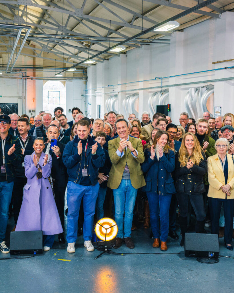
This extended beyond showing the feeling from the car itself to the atmosphere of the launch event (the buzz of conversation, the energy of the crowd, and the shared excitement of something really special being revealed). The key was really conveying the feeling of joy that is given from driving the car and being at the launch event.
I used a cut section of the Supersport logo repeated and ghosted over the imagery to tie it all together and used a sympathetic treatment of typography and the existing logo where appropriate.
Striking the right balance was key – giving just enough teaser glimpses of the Supersport without revealing too much of the design ahead of the reveal. This involved a lot of back and forth with the marketing and PR team to align with launch cadence.
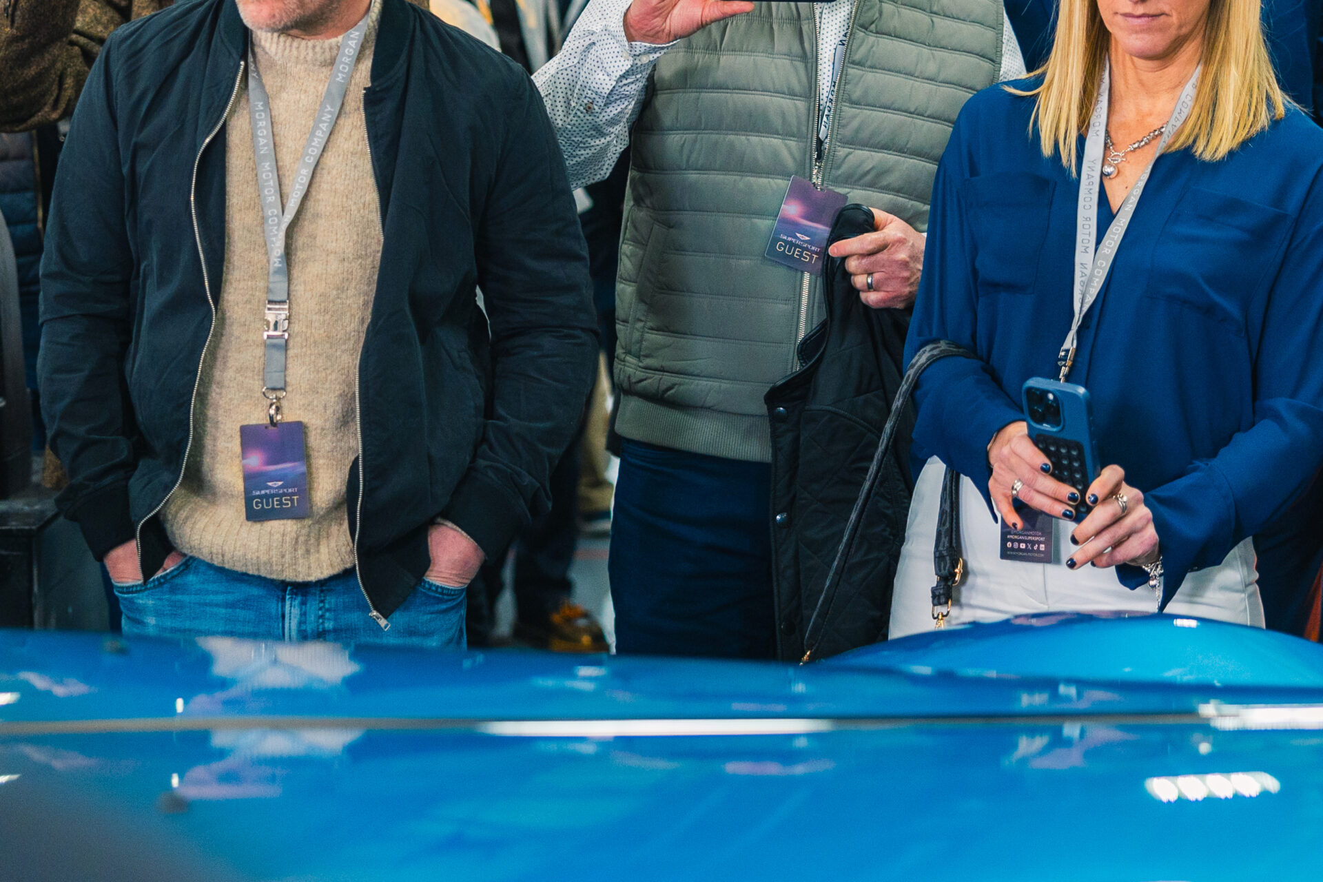
This was used in many forms, including: social media teasers, online press articles, the Morgan webpage, event graphics in both UK and Netherlands launch events (e.g. guest badges, banners, invitations).
Dark aubergine and light pink were the perfect colours for the Morgan Supersport because they strike a balance between elegance and edge. The deep aubergine offers the luxury and sophistication of an almost-black shade, but with a distinctive twist that feels more rebellious and individual. Paired with the soft, unexpected light pink, it creates a premium, fashion-forward palette that feels both classic and daring. These fit in well with the existing corporate colour palette and have now been adopted into the main corporate identity: