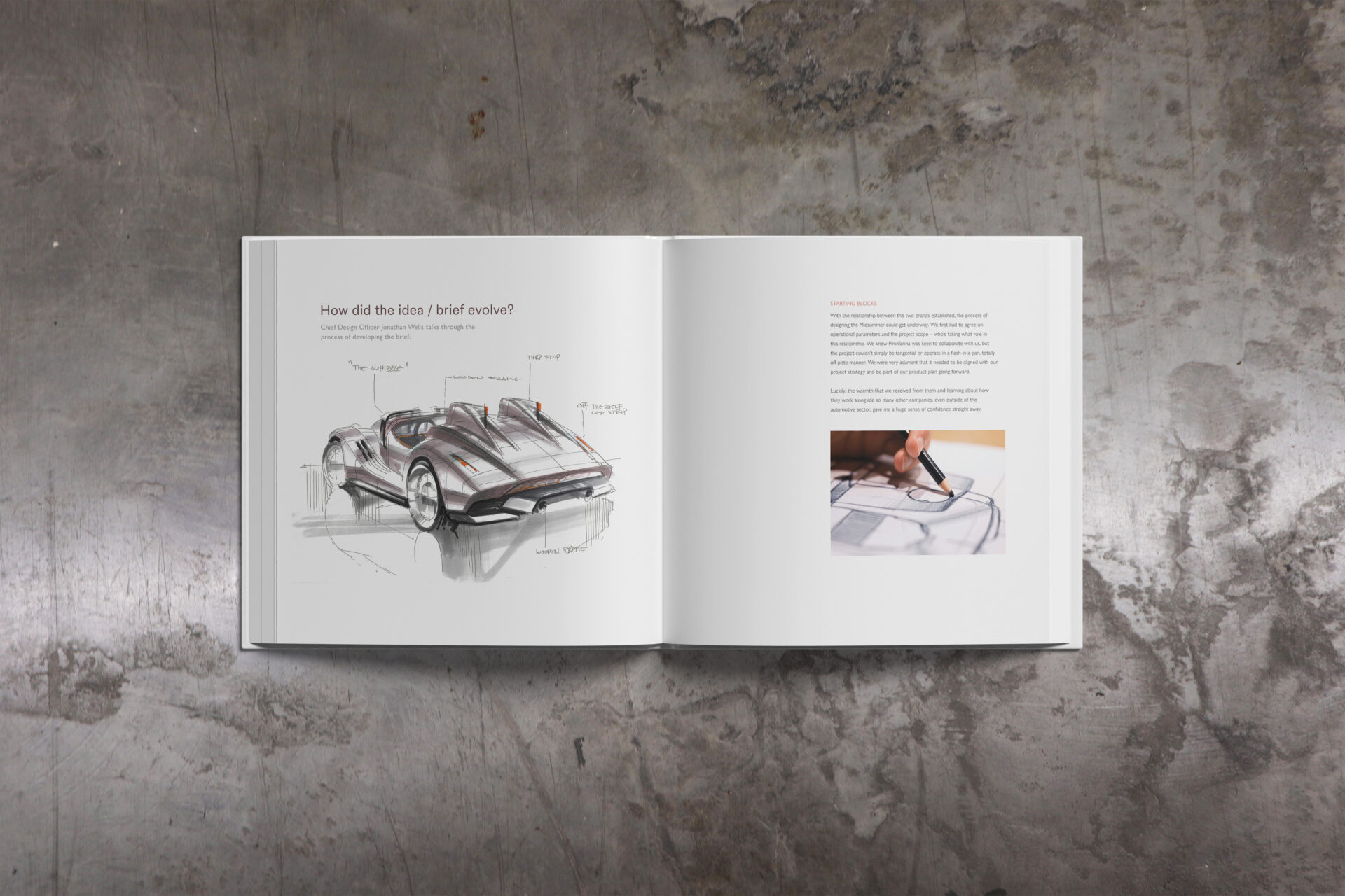
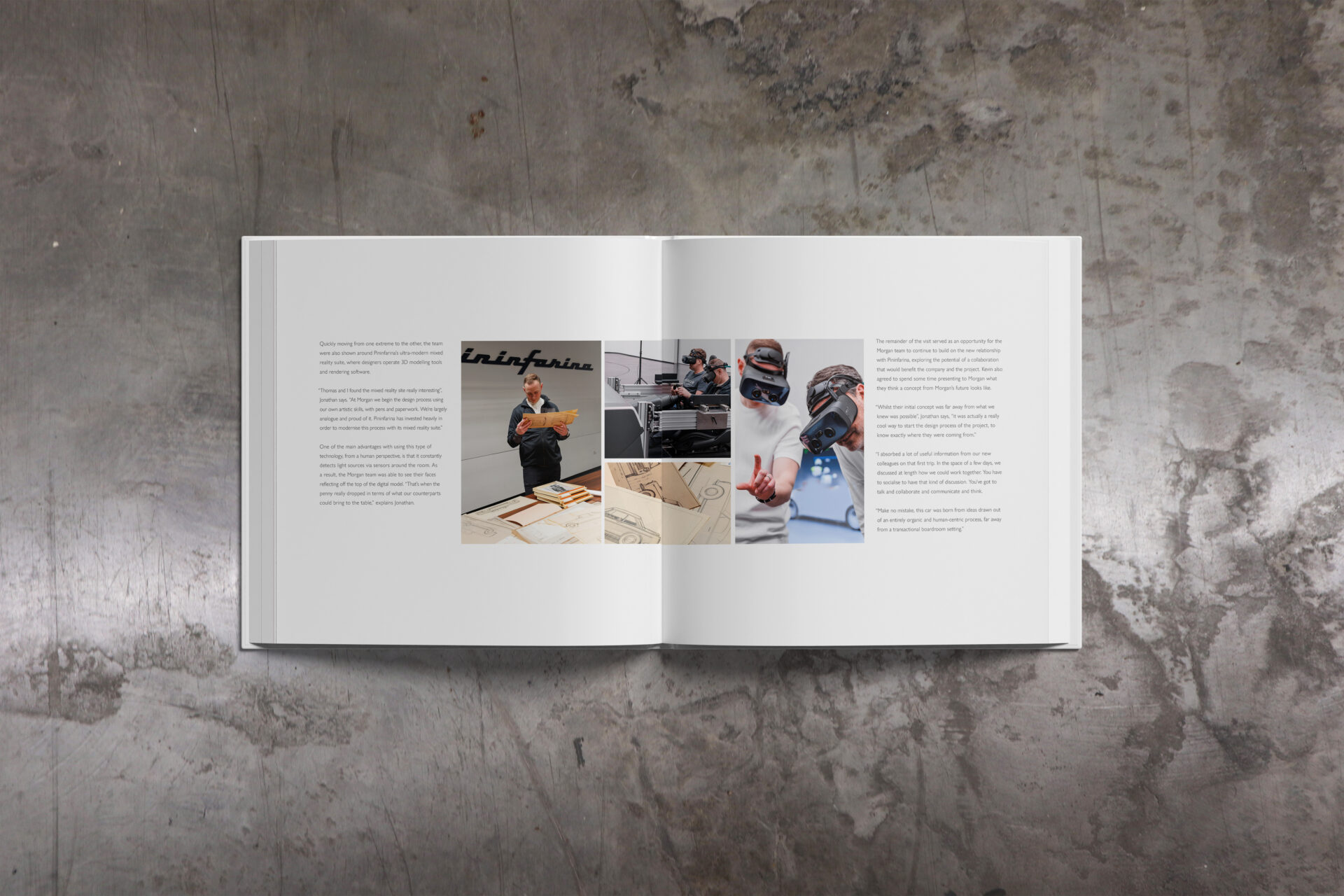
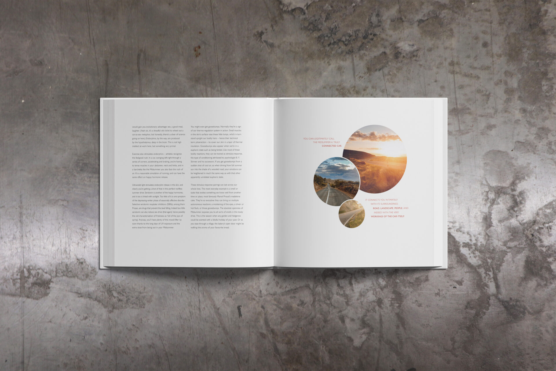
Design of three luxury books commissioned for customers of the Morgan Midsummer, a limited-edition Morgan designed in collaboration with world-renowned Italian design house, Pininfarina. I was the designer of the books, working alongside editors, writers and photographers.
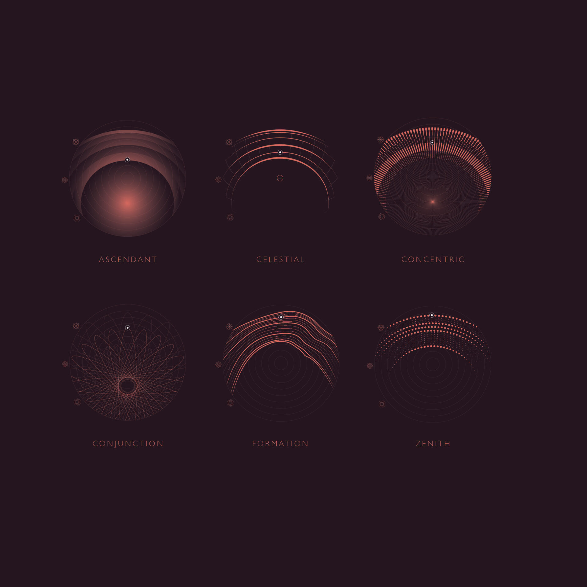
The name Midsummer serves as inspiration for the visual identity of this exclusive trilogy of books. At its heart lies a celestial narrative, told through six bespoke motifs that trace the arc of the sun across the sky – a metaphor for the evolution of an idea sparked when Pininfarina first visited Morgan into a finished masterpiece.
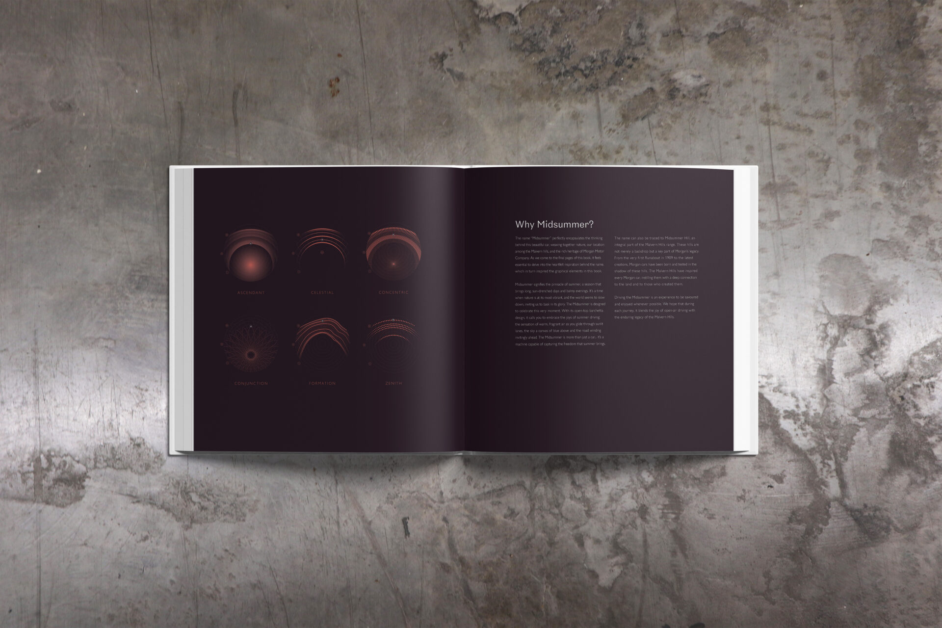
These celestial illustrations serve as section headings throughotu the book. Each motif has been carefully designed to echo the distinct character and emotion of each stage in the product journey, resulting in a collection that is deeply symbolic.
Ascendant marks the beginning of the journey, a radiant orb capturing the soft glow of an idea as it begins to form, flicker, and grow. It is the first stage of the design process for inspiration and is filled with promise and anticipation.
Celestial draws inspiration from aviation radars and flight paths: a series of arcs that mirror the collaborative spirit of the two creative teams, connecting across countries, visiting eachother’s headquarters.
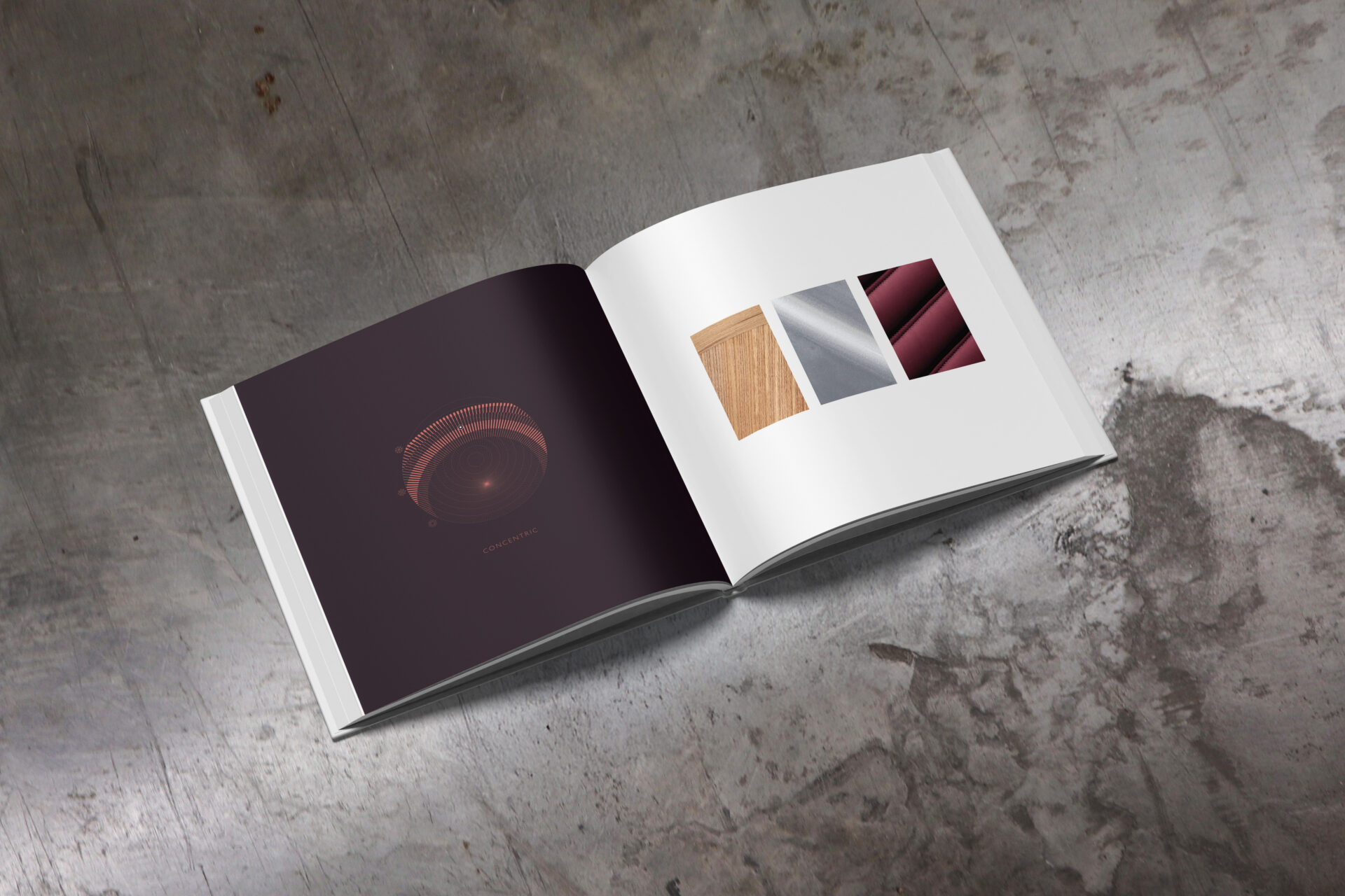
Concentric introduces a sense of precision and fine engineering. The motif has a linear structure including both the distinctive ‘piano keys’ of Midsummer’s design and hinting at the iconic heritage spoked wheels of previous Morgan cars. At this stage, the technical work took place.
Conjunction celebrates teamwork. A motif of intersecting forms captures the dynamic collaboration across Morgan’s departments. In this phase, design, engineering, and craftspeople work together in finalising the design.
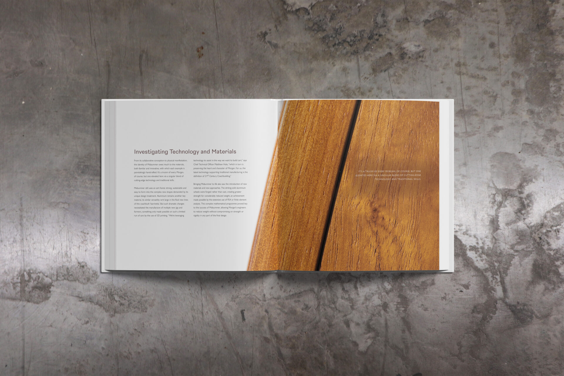
Formation pays tribute to craft. Inspired by the organic grains of woods used in each Midsummer, this motif honours the handmade artistry and dedication that bring each vehicle to life.
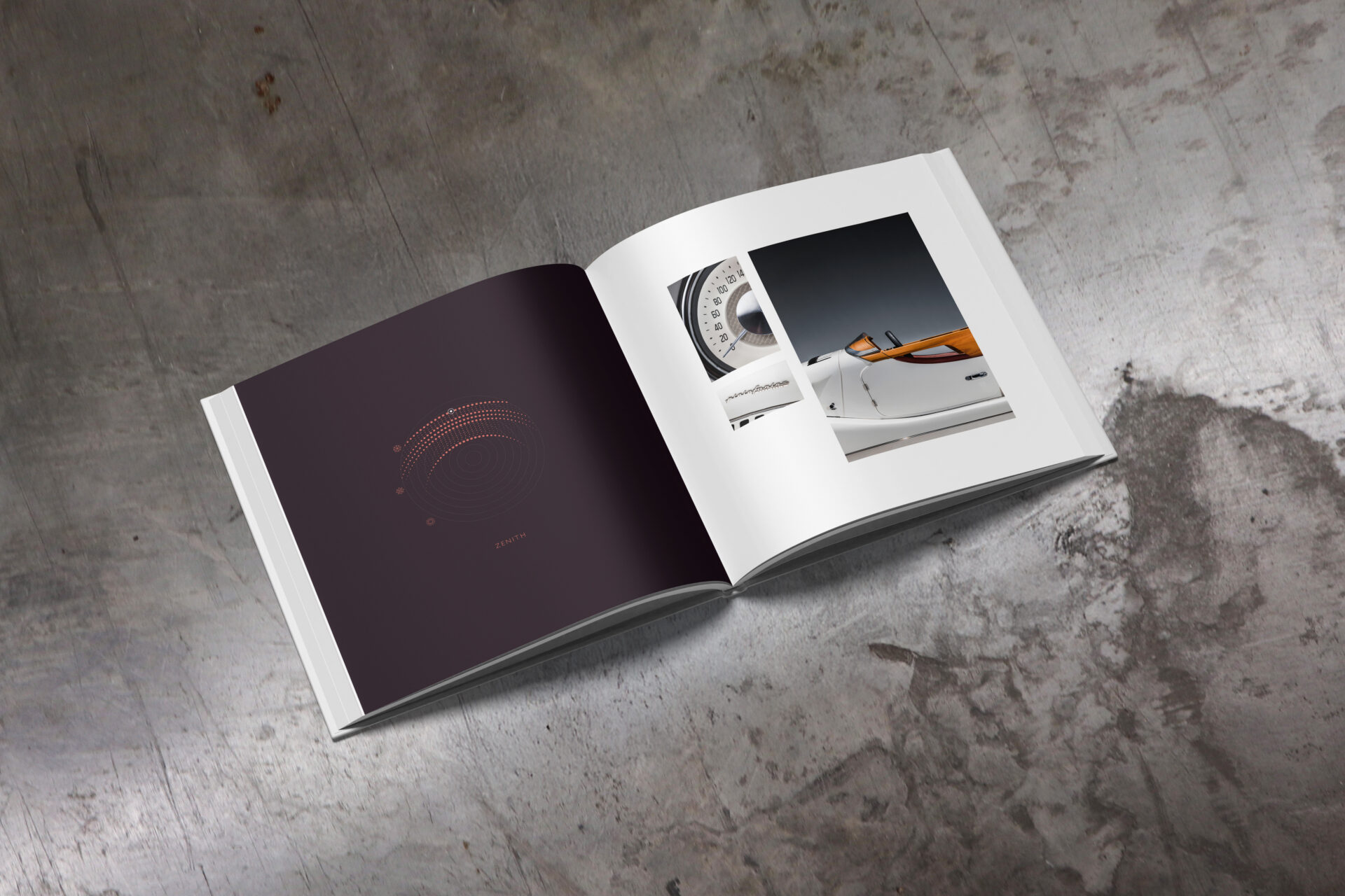
Finally, Zenith captures the launch: concentric signals radiating outward, representing the moment the world met the finished creation – a culmination of teamwork, precision, and shared vision.
Due to the nature of the vehicle, it was imperative that an accompanying trilogy of books should be of the highest quality, both in their contents and in the materials used to create them.
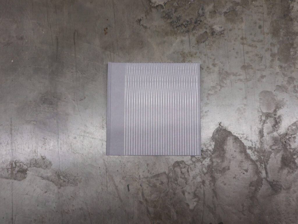
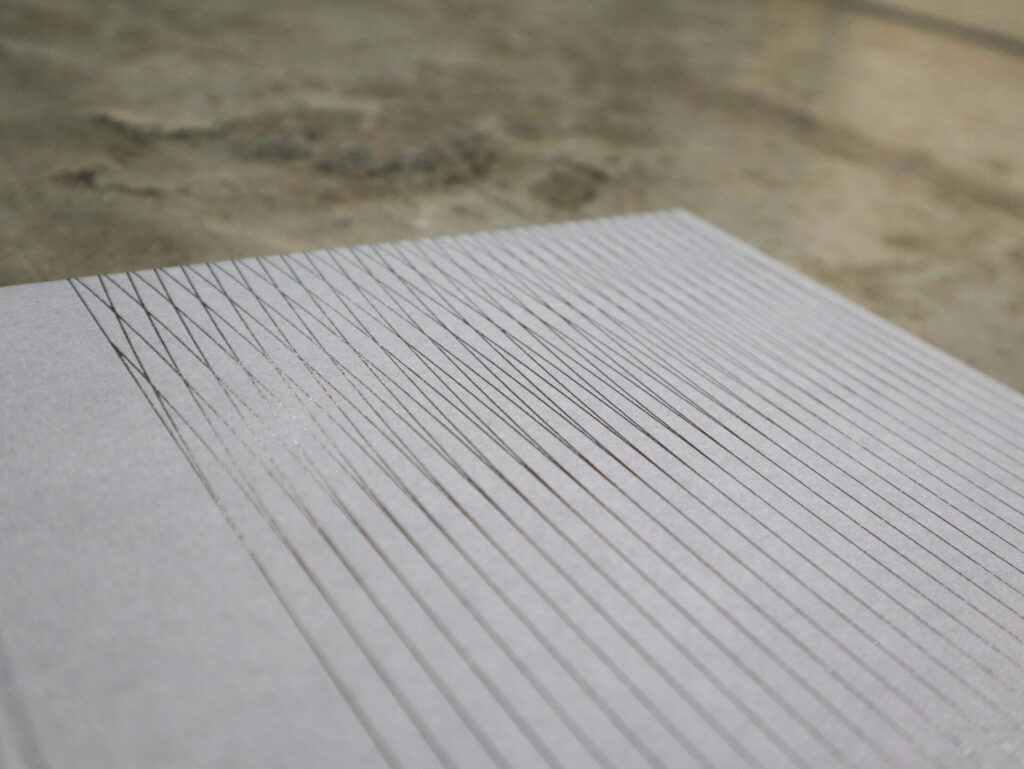
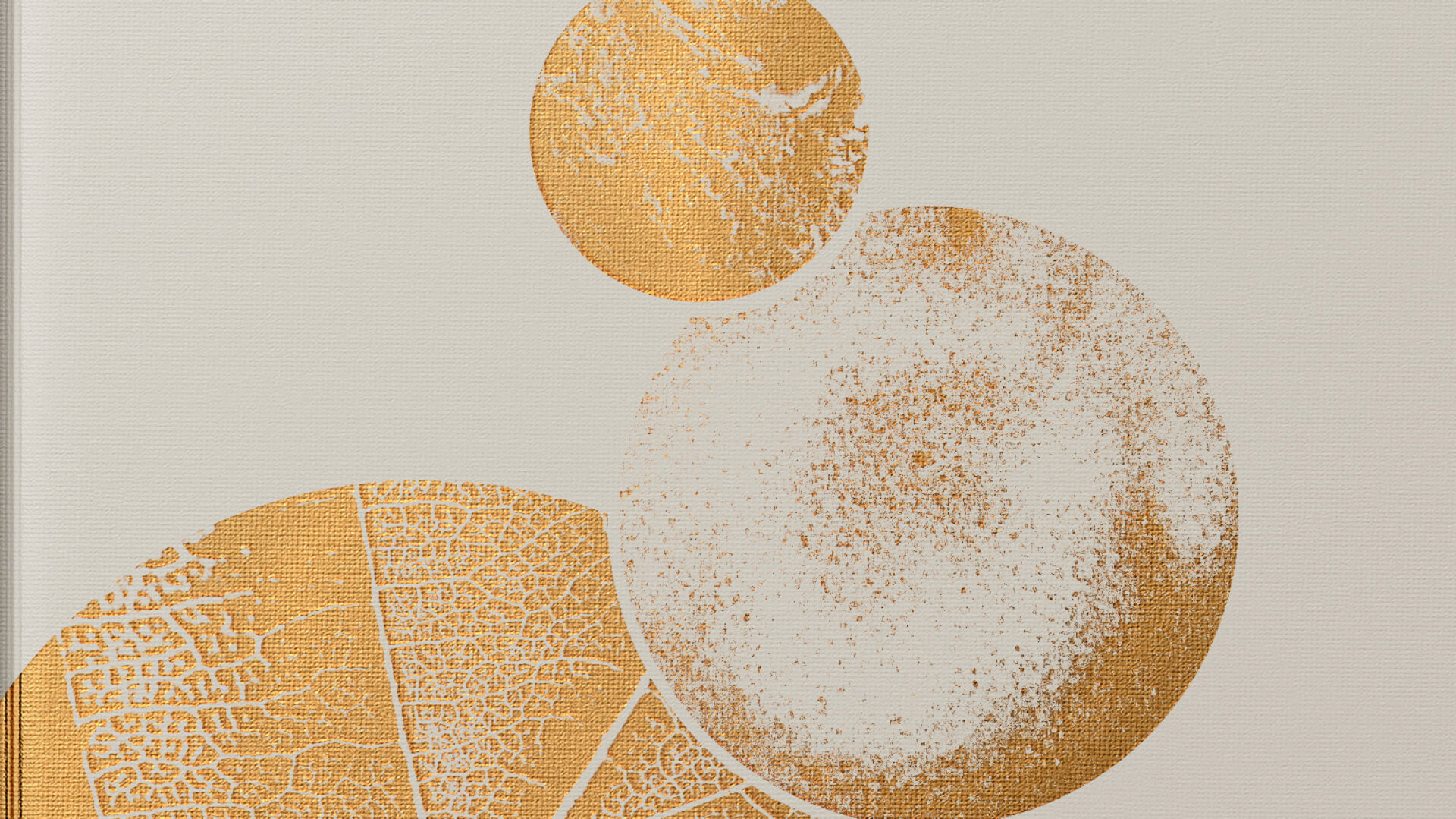
I chose chose a mid-grey colour paper on the cover for its understated sophistication and to add intrigue for what’s inside. The restrained colour palette on the exterior helps to surprise and delight the reader as they open it to reveal more vibrant, striking colours. This is accented with a gunmetal silver foil in a pattern that shows two paths crossing, to represent Morgan and Pininfarina joining forces, in a spoke formation that alludes to classic wire wheel spokes.
Interior pages of the book are a natural finish, matte paper which was chosen because it had an organic feeling as the pages are turned. For volume one, which discusses the history of each brand and how they came to collaborate, the matte finish perfectly displays the archive imagery, giving it a feeling of history. In later volumes, a distinct change from matte paper into a satin photographic paper is used for the moment of the car being finished.
This project involved creating a sub-brand identity for Midsummer which I then appliedin a variety of applications, as well as sharing with the rest of the design team for using in Midsummer-related design work. Some examples include: owner’s manuals, social media posts (examples below), sales contracts, video campaigns and a webpage.